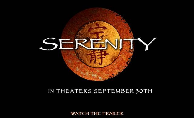
A few random thoughts about the movie.
1.) Great television show, good movie. Joss Whedon had some of the most innovative science fiction writing and filming with this show, so it is hard to make it more "innovative." I wish he had about 10 million more for special effects and about 10 million for marketing.
2.) The dialogue was still good. Joss has a way of "scuffing" dialogue. In this movie, he rubs western cliches against science fiction, with a generous dose of humor. It works really well--way better than "Buffy" ever did, in my opinion. I just don't cotton to valorizing high school talk. I didn't respect it when I was in junior high or high school, and I still don't respect it. Now, I don't like Western conventions because I grew up on a reservation, but I find that the mixture of speaking virtuosity, constant character attempts to decipher what the others mean, humility, and humor sounds exactly like what I remember on the rez. Last show I remember doing the same thing was Northern Exposure, but I digress.
3.) The "imperfect" film technique (CGI odd angles, treating the ship like a character, putting in light flares and off-center shots) makes this "Millenium Falcon-Stagecoach" (Whedon called his show this in the first season DVD documentary) scenario feel more authentic. George Lucas could have saved a lot of money and grief had he just kept more imperfections to let people get closer. After the first two Star Wars movies, I stopped caring about the characters. In Firefly, and Serenity, I never stopped caring. I think this is a result of Lucas making his films more technically correct and cold and Whedon keeping the focus on the characters, including the spaceship, as imperfect, and imperfectly knowable.
4.) The characters. I can't believe that my favorite character doesn't make it. I felt like I lost a best friend, and I'm still in denial. Seriously. I've never EVER mourned a fictional character, and I mourn this poor soul.
5.) My biggest gripe with with the use of Papyrus font for not only the poster (puh-leeze hire a better marketing firm--one that doesn't double as a wedding invitation publisher), but also as the lettering on the side of the Serenity. As a typography geek, I am offended that someone would spend millions to make sets look completely real, but won't take a trip down the mac font menu to see how incredibly common their font choice is. Everyone with any passing typographical experience (you know, educated people who work at their desks) will probably recognize this as a ready-made font. The font choice is what most people will notice when they see the poster and trailer. While they were at it, maybe they could have included some Word clip-art too. The coup de grace was when Inara is seen painting the same font on the side of the ship at the end. Wow, that's bad. I know, only a typographic geek would care. Still, all of the work that is done to make the movie live and breathe as a unique world should extend to the invitations (trailer, movie poster, internet banner ads). Wait! Maybe they should have hired a custom wedding invitation company to make the poster. I'm sure they have tons of interesting fonts...